Learn how to practically use AI to create graphs, charts, and plots for your students.
You know how it goes.
You’ve got the data or the idea, but somehow turning it into a chart that looks clear, engaging, and age-appropriate ends up eating way more time than you planned. And even then, it doesn’t always feel like it hits the learning goal you had in mind.
That’s where this tutorial comes in. You’ll see how to structure prompts so ChatGPT, Copilot, Gemini or other AI chatbots give you charts that are accurate, aligned with curriculum standards, and tailored to your students’ needs. You’ll also find examples across different subjects and grade levels so you can adapt the process to your own classroom. You’ll also discover a more effective solution - an AI graph and chart maker - that will make your entire workflow more manageable.
Before creating graphs and charts, you probably already consider several aspects, but your AI tool of choice will need the context as well. So think how it can help with your requirements.
Objectives and learning outcomes: What skills will this graph or chart help your students with?
Always connect the chart to what you want students to do. If the objective is “compare categories,” then maybe a pie chart of energy sources will lead to the outcome “students can interpret percentages.” If the objective is “spot patterns,” then a line graph of temperature makes sense. This way, the chart becomes a tool and not just a picture.
Types of graphs and charts: What would be the right chart type for the skill?
Pick the right chart for the job. Bar charts are great for comparing categories. Line graphs work for changes over time. Venn diagrams are perfect for comparing characters in a story. Choosing the wrong type can leave students confused instead of confident.

Source materials: What kind of sources should you use?
Use real and relatable materials. Classroom survey data, short passages from a story, or authentic statistics work best. A population bar chart using World Bank data makes geography feel more real. A Venn diagram from ‘Charlotte’s Web’ gives students a concrete way to think about character traits. The more authentic, the better.
Curriculum standards: How do you tie the graph/chart to the curriculum standard you follow?
Your charts should never feel like extra decorations. Tie them directly to the standards you’re working on. If the standard says “students will analyze trends in data,” then a line graph of weekly rainfall is right on target. This way, the chart becomes purposeful.
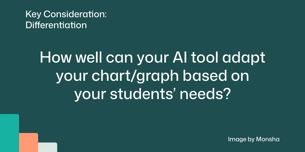
Adaptability: How easy will it be to customize the graph/chart based on your students’ needs?
Think ahead about how different students might engage with the chart. You might give struggling students a simpler dataset, while advanced students work with more categories or even design their own chart. For example, in geography, some students could compare three countries, while others compare all seven in South Asia. Same activity - different entry points.
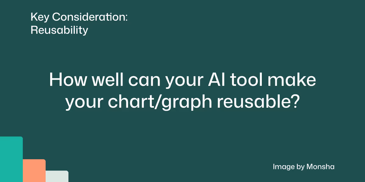
Reusability: How does the graph/chart fit in your existing workflow?
Creating graphs and charts that you can use again will save you a ton of time. Imagine you’ve designed a bar chart showing your students’ favorite fruits. If you keep it reusable, you can easily update it with new data next year or swap in a different survey topic without starting from scratch. The same chart template could even be adapted for other subjects, like showing favorite science experiments or book choices. That way, one well-designed chart keeps working for you over and over.
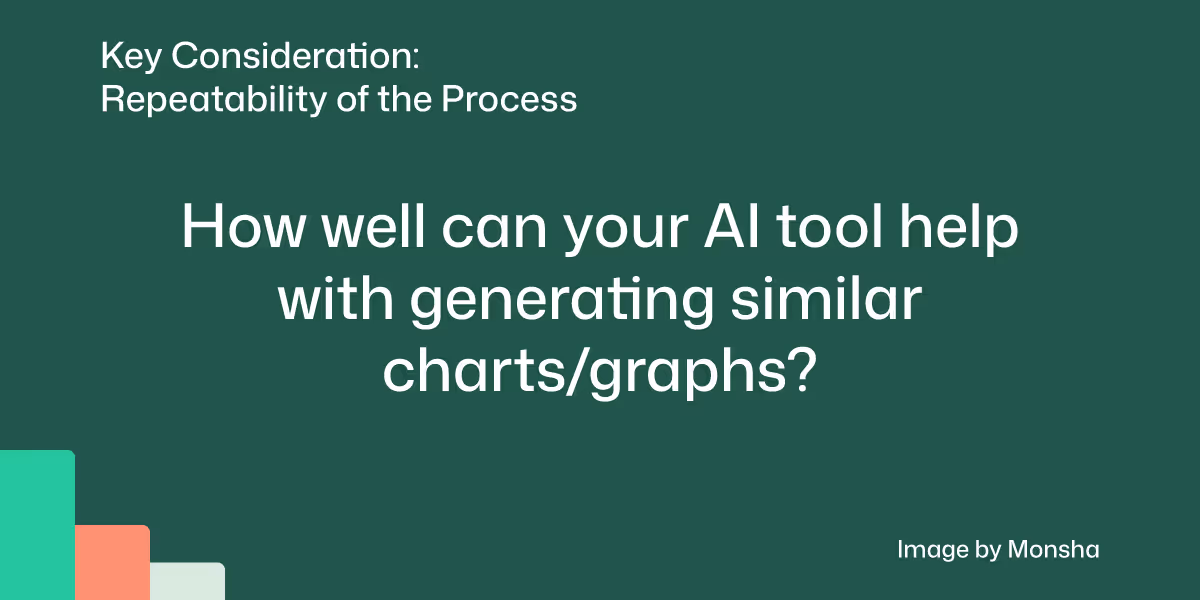
Repeatability of the process: How consistently and quickly can you prepare similar graphs and charts?
If you know exactly how to organize your datasets, you can generate charts quickly and consistently each time. For example, every time you want a line graph of weekly temperatures or a pie chart of energy sources, following the same process ensures the output is classroom-ready without a lot of trial and error.

Now that we have set our approach with the key AI considerations outlined in the previous section, let’s define the scope of this exercise. We’ll keep it simple so that the strategy remains flexible and easy to follow.
We’ll generate a chart for a group of 8th grade students. The goal is to help them understand global demographic distribution.
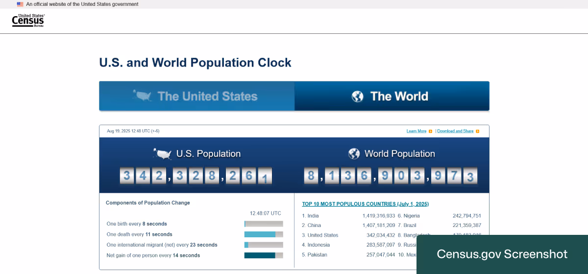
For our source dataset, we’ll use a spreadsheet containing data about the world's top 10 most populous countries. You can find and download the data on the United States Census Bureau website's Population Clock page. Just keep in mind that you may have to convert the CSV file to a regular Excel workbook so that it’s usable across multiple AI platforms.
Let’s try the approach that will give you the quickest output with minimal effort.
1. Navigate to Monsha and log in.
In case you’re not a registered user, you can sign up for free. It takes only about a minute.
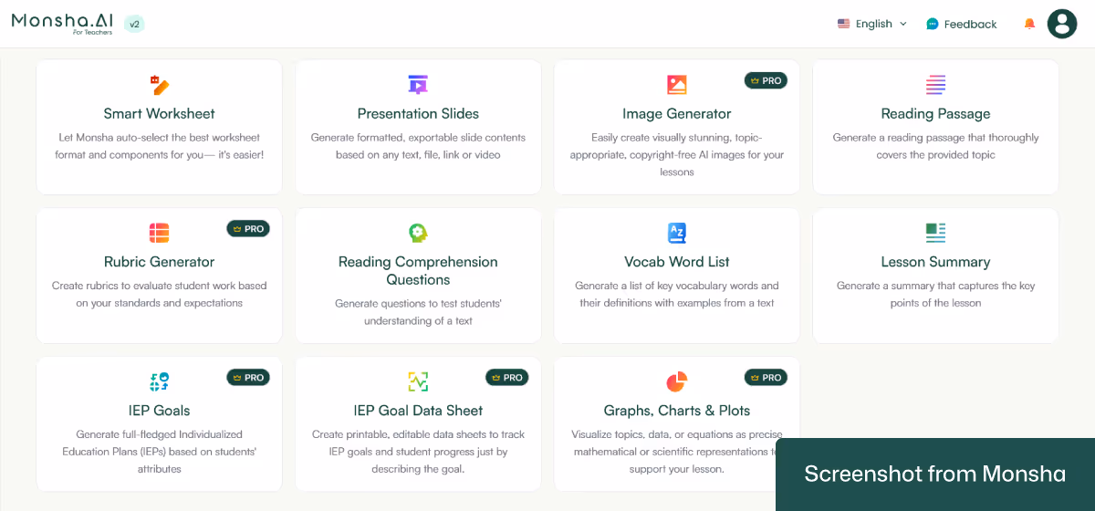
2. Select the Graphs, Charts, and Plots tool.
After logging in, you’ll find a list of different tools to create your teaching resources, from lesson plans to worksheets to presentation slides. Expand the list by clicking on See all tools. Then choose Graphs, Charts, and Plots.
3. Configure your settings and upload your Excel file.
On the configuration screen, you can easily specify your context with a few clicks. The most basic options are Grade and Language. So set them right away.
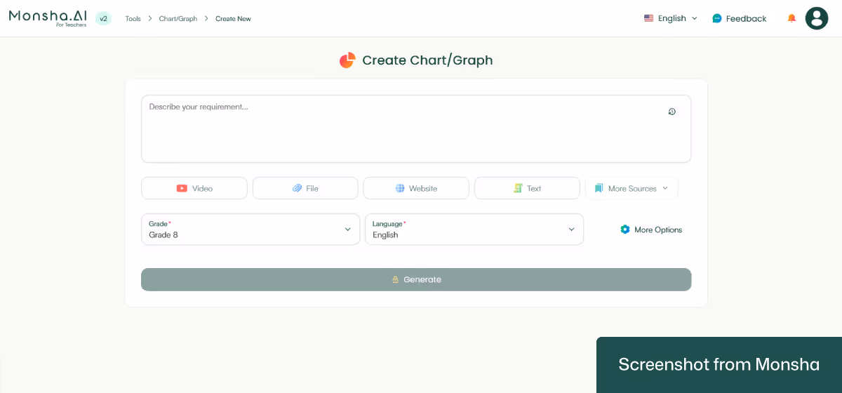
Now, with Monsha, you can use different source materials to create your graphs and charts. Such as:
We’re going to need the File option for today’s tutorial. So click on it. Once a window pops up, drag your Excel file to it. By the way, it’s possible to select a file from your Google Drive as well.

That’s pretty much it!
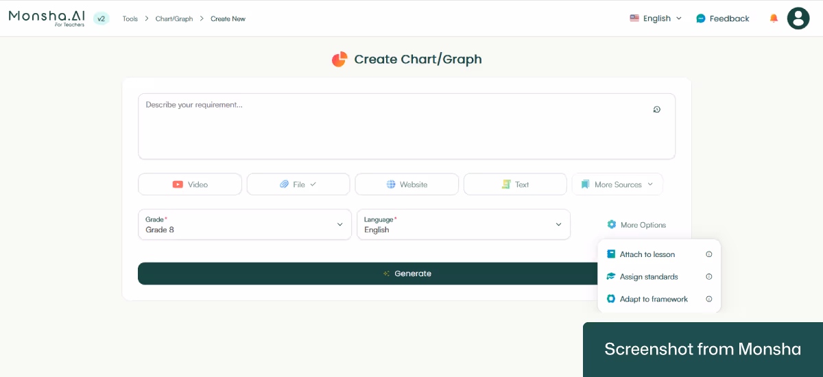
The interesting thing is, you can refine your configuration even further. For example, using multiple source materials is possible with Monsha! You’ll also be able to assign your graph or chart to a course, unit, or lesson. This is a convenient option if you design your entire course and create other resources with Monsha.
There’s more. You can incorporate specific curriculum standards or educational frameworks (e.g., Bloom’s Taxonomy) into the process! In case you have more requirements, all you have to do is type what you need in the “Describe your requirement…” text area. To create a topic-based chart, for example.
4. Click Generate.
And you’ll get your chart in seconds!
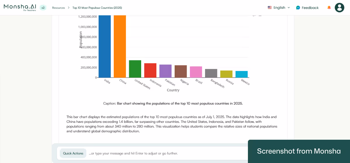
This is what we got:
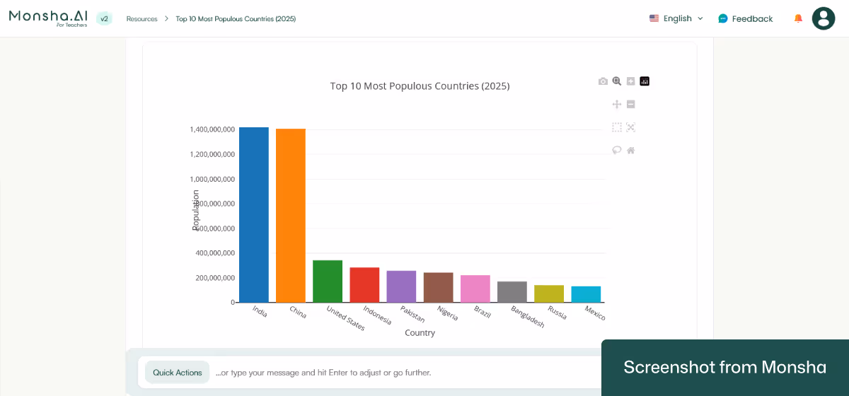
Not only has the chart included the data with proper labels, but it also has added a helpful description.
Monsha doesn’t just generate a chart or graph for you and call it a day. Since it is dedicated to teachers and educators, you can take the output to another level. Here’s how.
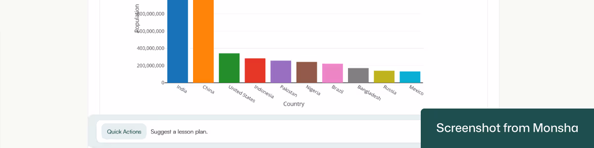
Once you have your chart, you can ask Monsha to create another version or include more relevant components. All you have to do is write a prompt. The prompt doesn’t even have to be sophisticated. For example, the “Suggest a lesson plan” prompt will add an entire lesson plan to the chart.
We’ve used the same prompt and got this result:
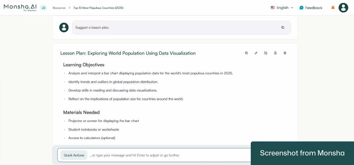
The newly updated version comes with a 1-hour lesson plan. Just to give you an idea - without the details, this is the outline:
Awesome!
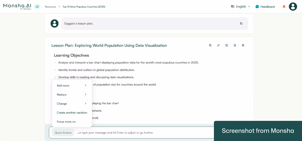
Well, there are times when you may find it difficult to frame your instruction. For instance, to change data perspective or reduce data points. In that case, use the Quick Actions feature, and it will create instructions for you!
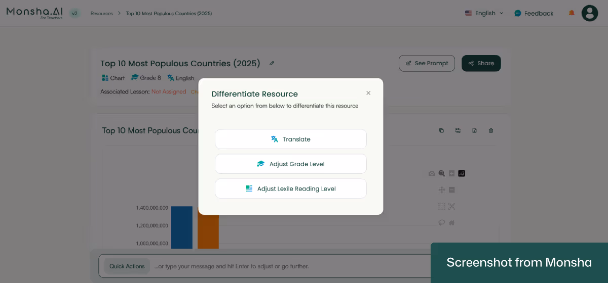
As you’ve seen in this tutorial, you can adapt your graph or chart based on grade level, language, and well-known frameworks when setting your requirements. You can do the same even after getting your output. For example, you can translate the chart and other components for your Spanish-speaking students or make it appropriate for 6th graders. So use the option to easily incorporate AI-powered differentiated instruction in your workflow.
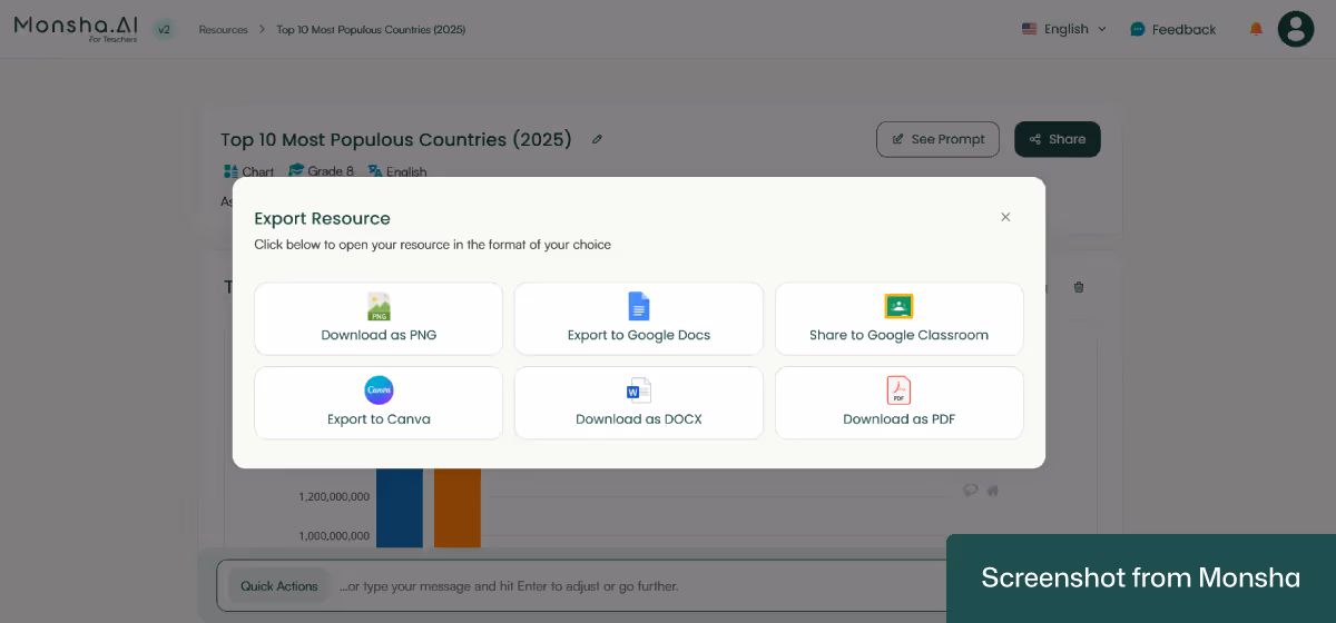
Download your chart as a PNG image, PDF, or a Doc file. You can export it to Google Docs, Google Classroom, and Canva as well.
If you need to create more charts or graphs, you can use the same prompt over and over. No need to make a fresh start.
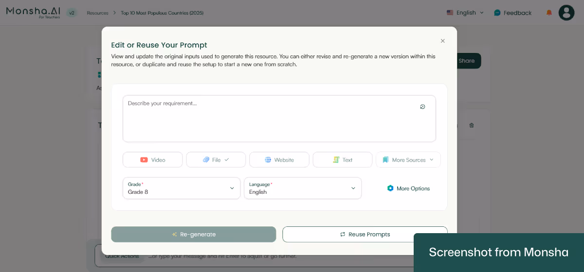
One more thing. Your chart as well as any other resource you generate with Monsha will remain accessible via your account.
When you ask ChatGPT or other general-purpose AI chatbots to generate a graph or chart, the way you write your prompt makes all the difference. If you simply say “make me a bar chart about fruits,” you might get something that looks fine but isn’t really usable for your students. To make the chart classroom-ready, you need to guide the AI with teaching-specific prompts.
The main thing to remember here is that the clearer you are with your instructions, the more usable the chart will be. If you spell out grade level, objectives, outcomes, and data, your AI tool can give you something that will actually serve a clear purpose in your lesson.
Okay. That’s the theory, but how do you incorporate these components in actual prompts? Let’s take a look at a few prompt templates and practical examples. Customize them to suit your teaching style and requirements. In case you need more examples, feel free to browse our AI prompt collection for teachers.
“Create a [type of chart/graph] for [grade level] students learning in [language]. The subject is [subject/topic]. Align the chart with [curriculum standards]. The lesson objective is [objective]. The learning outcome is [outcome]. Use this source material: [dataset, spreadsheet, classroom survey, passage, PDF, or link]. Make the chart age-appropriate, clear, and engaging.”
“Generate a [type of chart/graph] that helps [grade level] students studying [subject] in [language] understand [concept]. Align it with [curriculum standards]. The objective is [objective]. The outcome is [outcome]. Use the following source material: [statistics, government dataset, online link, or spreadsheet]. Keep labels simple and design student-friendly visuals.”
“Create a [type of chart, e.g., Venn diagram/timeline] for [subject] at [grade level]. The chart should be based on this source text or material: [story passage, article, or excerpt]. The objective is [objective]. The learning outcome is [outcome]. Align with [curriculum standards]. Ensure the chart is visually clear and appropriate for [language of instruction].”
“I want a [type of chart/graph] for [grade level] students in [subject]. The chart should use this dataset: [list numbers, categories, or table]. It must align with [curriculum standards]. The objective is [objective]. The outcome is [outcome]. Make the chart easy to read, visually engaging, and suitable for [language].”

Just a quick note. We’ve used dummy data in these examples.
“Create a bar chart for Grade 3 math students learning in English. The topic is ‘Favorite Fruits in Our Class.’ Use this dataset from a classroom survey: Apples – 8 students, Bananas – 5 students, Grapes – 10 students, Mangoes – 7 students. Align with the math standard: ‘Students will learn to read and interpret bar graphs.’ The objective is for students to compare categories, and the outcome is for them to identify the most and least popular fruit.”
“Generate a line graph for Grade 7 science students in English. The topic is ‘Daily Temperature in [City Name] (August 1–7, 2023).’ Use this dataset: Aug 1 – 32°C, Aug 2 – 31°C, Aug 3 – 34°C, Aug 4 – 33°C, Aug 5 – 35°C, Aug 6 – 36°C, Aug 7 – 34°C. Align with the national curriculum science standard: ‘Students will interpret trends in environmental data.’ The objective is to help students analyze patterns, and the outcome is for them to describe temperature changes over time.”
“Create a pie chart for Grade 10 social studies students learning in English. The topic is “Global Energy Sources in 2024.” Use this dataset from the [Source]: Oil – 29%, Coal – 26%, Natural Gas – 23%, Renewables – 15%, Nuclear – 7%. Align with the curriculum standard: ‘Students will analyze global resource distribution.’ The objective is for students to compare proportions, and the outcome is for them to evaluate energy dependence.”
“Create a Venn diagram for Grade 5 English students. The topic is ‘Comparing Two Characters from Charlotte’s Web by E. B. White.’ Use this source text: [insert passage describing Charlotte and Wilbur]. Align with the Common Core ELA standard: ‘Compare and contrast two characters.’ The objective is for students to identify similarities and differences, and the outcome is for them to use text evidence in their answers.”
“Generate a histogram for Grade 11 Cambridge math students. The topic is ‘Distribution of Exam Scores.’ Use this dataset: 45, 50, 52, 55, 58, 60, 61, 62, 64, 65, 66, 68, 70, 71, 72, 73, 75, 76, 77, 78, 80, 81, 82, 84, 85, 86, 88, 90, 92, 95. Align with the curriculum standard: ‘Students will analyze frequency distributions.’ The objective is for students to describe patterns in data, and the outcome is for them to interpret skewness and spread.”
As helpful as general-purpose AI tools are, it can be tricky to explain all your requirements clearly in a single prompt. You might need to specify the grade level, subject, learning objectives, curriculum standards, type of chart, and source data all at once. If any detail is missing or unclear, the chart you get might not match what you actually need for your lesson, which can be frustrating and time-consuming. That’s where a classroom-focused solution can help you. It will help you create charts that are aligned with your objectives more reliably. It turns what could be a trial-and-error task into a smoother workflow, so you can spend more energy on teaching and less on tweaking charts. To see how it saves your time and helps you effectively handle your workload, try Monsha out today.


AI for Teachers
We’re the Monsha Team—a group of educators, engineers, and designers building tools to help teachers combat burnout and get back to life.. Our blogs reflect real classroom needs, drawn from conversations with educators around the world and our own journey building Monsha.
Join thousands of educators who use Monsha to plan courses, design units, build lessons, and create classroom-ready materials faster. Monsha brings AI-powered curriculum planning and resource creation into a simple workflow for teachers and schools.
Get started for free
.png)
